
Logos are more than just an essential part of branding. They’re also the first aspect of your ecommerce store target audiences will notice. And it goes without saying that first impressions matter.
A great logo design ensures that said first impression is a positive and memorable one. But getting that logo design right isn’t an easy task. There’s a lot that goes into successful logo design, much of which we’ll touch on as we break down how to design a logo.
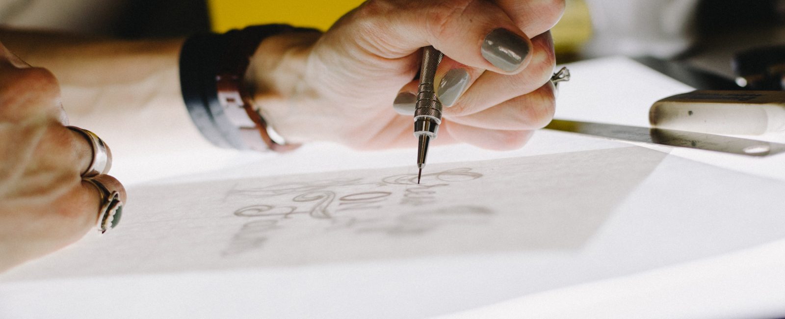
#1 Keep It Simple
Take a look at any of the most successful logo designs in recent history and you’ll find one thing in common: simple designs. Whether it’s the delightfully simple yet iconic Apple and Nike logos to the straightforward wordmark logos employed by FedEx, the best logo designs are quite minimalist in their presentation.
Simple logo designs are easy for people to scan quickly, plus they’re also easy to remember. Forget about making an ornate design with loads of details – your logo needs to crisp, concise and straightforward. If your ecommerce business has a long name, for example, consider using just its initials in your design.
Simplicity is the secret sauce that makes for a visually tasty logo. Data shows that if it takes more than a few seconds for anyone to recognize your logo, then it’s time to head back to the drawing table.
#2 Make Sure It’s Relevant
Not only do you want your logo to be simple, but it should also appeal to your target audience. A car-themed logo might look fantastic, but for a cycle shop that specializes solely in bikes, it’s guaranteed to fall flat with the target audience. Ditto for a logo designed with pizzerias in mind, but aimed at an audience expecting barbeque.
Relevancy counts when designing an ecommerce store logo. You’ll want a logo that speaks to your audience’s wants, needs and interests along with their expectations of what your store has to offer. That means designs that your customers can connect with, yet still distinctive enough to stand out from the rest.
Audience research plays a big role in ensuring your logo designs stay relevant to your target audience. Knowledge of your local community also helps, as it gives you valuable insight into your audience.
#3 Ensure It’s Easy to Read (Use of Fonts)
Logos need to be recognizable at a glance. However, that’s hard to do when a logo proves hard to read, usually due to poor choices in typography. That’s especially important for wordmarks where the typography makes or breaks the logo.
As you design your ecommerce store logo, keep in mind how you use typography. Make sure the typefaces you’re using for your logo are consistent with your brand identity. Keep in mind that different font types invoke different emotions in your target audience.
Serif fonts, for instance, are perfect for logos with a classic or traditional approach. Slab serif fonts are bolder, larger and usually feature a vintage or rugged vibe. That approach makes them perfect for logos aping the vintage look.
Meanwhile, sans serif fonts are truly the Jack of All Trades, useful for a multitude of logo designs. These fonts are clean, economical and easy to read at a wide range of sizes. Script and handwritten fonts are great for creating logos with a causal, homespun feel or a logo with an elegant touch.
#4 Strive to Make It Memorable
What use is an ecommerce store logo that no one remembers? The last thing you need is a logo that’s easily forgotten by your target audience or confused with something similar. The global majors managed to tackle that problem through various approaches to their now-iconic logos.
Don’t be afraid to step outside of the box when it comes to your logo. Straying outside of the conventions of logo design can help add a unique twist to your logo, making it easier for target audiences to remember.
Colors also play a big role in making logos more memorable. Bright, vivid primary colors are more likely to catch one’s attention than a logo decked out in dull, neutral shades. Nevertheless, you’ll want black-and-white versions on hand for monochromatic printing, just in case.
#5 It Should Be Versatile
Versatility is yet another trade you’ll want in your ecommerce store logo. Whether your logo lands on digital screens, traditional print or television, you want it to be versatile enough to be seen regardless of where it ends up.
These “responsive” logos can change colors to fit with print use. Some companies even have dedicated logos reserved solely for small items and distinctive services. The end goal of a responsive logo is to as adaptable and flexible as possible.
Take Disney’s responsive logos, for example. Designers of the Mouse House’s logo took to paring down the details as it scaled up and down in size. This level of versatility makes the Disney logo effective on large and small screens alike, not to mention printed materials.
Here are a few ways you can make your logo flexible enough to fit a variety of use cases:
- Create four or more different versions of your logo, starting with your master logo that features all of the frills and details. From there, continue to simplify your logo until you reach your last and simplest iteration.
- Don’t be afraid to add and/or omit details as you scale your logo. Adjust the complexity of certain visual elements as needed.
- Use abstract symbols to represent larger logos at smaller sizes. The Heinz logo does this perfectly by downsizing until there’s just the outline of the original label left.
- Above all, keep your logo designs consistent. All versions of your logo should bear a strong family resemblance to each other.
- Try rearranging certain logo elements, including stacking elements horizontally or vertically.
#6 Don’t Jump on Trends (Make It Timeless)
Keeping up with modern trends in logo design is one thing. Blindly following those trends to create logos that quickly look dated is another. The best logos aren’t locked into a particular time period – instead, they transcend time to get the job done regardless of era.
Timelessness is a must for any successful logo design. That means staying off the hype train and designing a logo with evergreen qualities. Certain trends can quickly date your design, leaving it stuck in a time warp until the next update.
That’s not to say that updates are bad or something you should avoid. Famous logos undergo makeovers every so often, usually to refine certain characteristics for a fresher look and feel. For instance, famous designer Paul Rand brought the IBM logo into the 1970s by trading its already-minimalist type-based logo for horizontal lines and negative space. Those changes continue to endure even to this day.
#7 Use the Right Tools
Creating an awesome logo means using the right tools for the job. Fortunately, you have plenty of options to choose from when it comes to logo design. These include using industry-recognized programs like Adobe Photoshop or Illustrator to design your own logo from scratch.
Not everyone is a pro at logo design, nor do we always have the time or the programs needed to create a spectacular logo. That’s where a logo maker can come to the rescue. Logo Makers are the perfect mix of DIY and software, many of these logo makers use AI to create logos that are often indistinguishable from pro designers.
You can also hire a freelance designer to bring your desired logo to fruition. Depending on their experience and knowledge, a freelancer can create stunning works that surpass anything created with a logo maker. Working with experts also gives you greater insight into the design process. However, the overall quality greatly depends on who you hire, the project timeframe and the level of communication between you and the freelancer.
Design agencies are another option for logo design. They charge a bit more than freelancers, but their combined professional experience comes in handy for creating logos that work for your ecommerce business.
Conclusion
Designing a great logo for your ecommerce store is no easy feat, whether you decide to go at it alone or hire a freelancer or design agency. With the above tips, you’ll know what to look for in a logo and how to execute your vision of your ecommerce store’s most important branding device.


